charles
Two redesigns of the website, one complete rebranding, a new font specifically built for the brand, lots and lots and lots of presentations, templates and component libraries, Instagram and LinkedIn ads. This is the most comprehensive brand and product project I've done.
Team
Maxine Hess
Andrey Frolov
Etienne Kiefer
Context
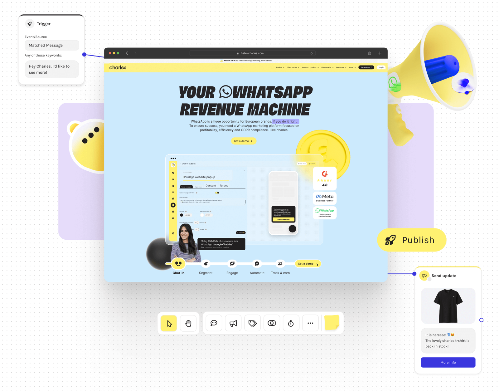
Charles is a WhatsApp marketing tool, it allows businesses to send newsletters to their subscribers. But since WhatsApp is a very interactive medium, the type of campaigns that can be done are very appealing for customers and very useful for businesses to further improve their targeting.
The results
A new logo, an entire new website, more consistent tone of voice, a new custom made font, better defined content direction and a whole lot of color.
BUT
it also entailed the creation of methods to maintain the brand in line across all communication and in better ways of implementing content onto the website.
Also an insane increase in SEO reach, brand perception, interest, and best of all, copycats!
B2B is BOOORING (?)
The main idea with the redesign we wanted to make with charles was to step away from the usual B2B approach, step out of that lane, and let us build our own way of doing B2B marketing.
The usual B2B space is muddled with royal blue and overly optimistic stock images. And within the marketing space the competition aimed to appear very professional but falling into staleness and sameness.
1st step: design the logo and visual language
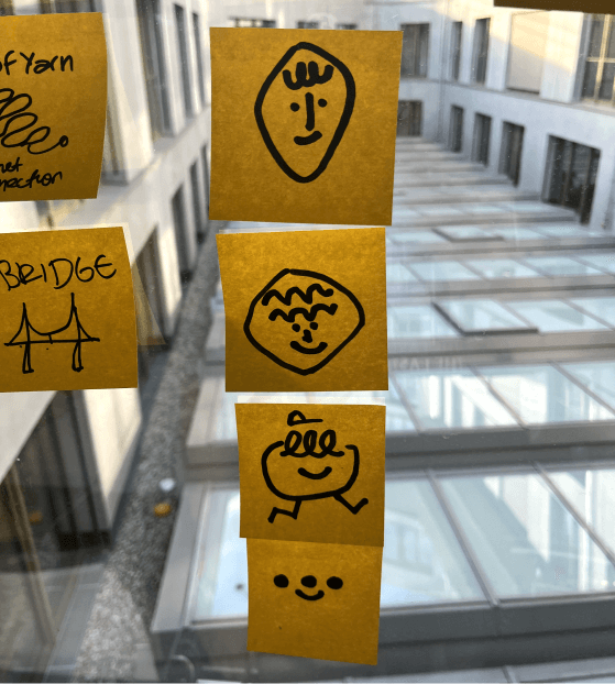
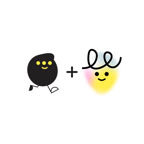
The logo:
An unlikely collab
We contacted Kulture Type and asked them to build the voice defining aspect of our brand: the font. They gave us charles sans and charles inktrap:


Check their case study about this fantastic font on their Behance profile
2nd step: A new home
I had already done an entire redesign of the website early when I joined charles, now I needed to redesign the website (again!) and lead the implementation of the brand and new features.
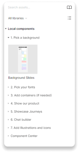
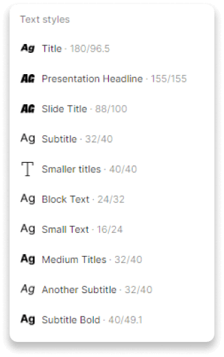
3rd step: Create, document, distribute
I did some guidelines, if you're interested to see more and we're interviewing please click on the button below!

If you want to see more details and take a look at the prototype click here:
A library not only for designers
I built a comprehensive library of components that fulfilled:
I aimed to build components that didn't need any designer overview. Any user should be able to pick and choose and edit what they needed directly through the component options.

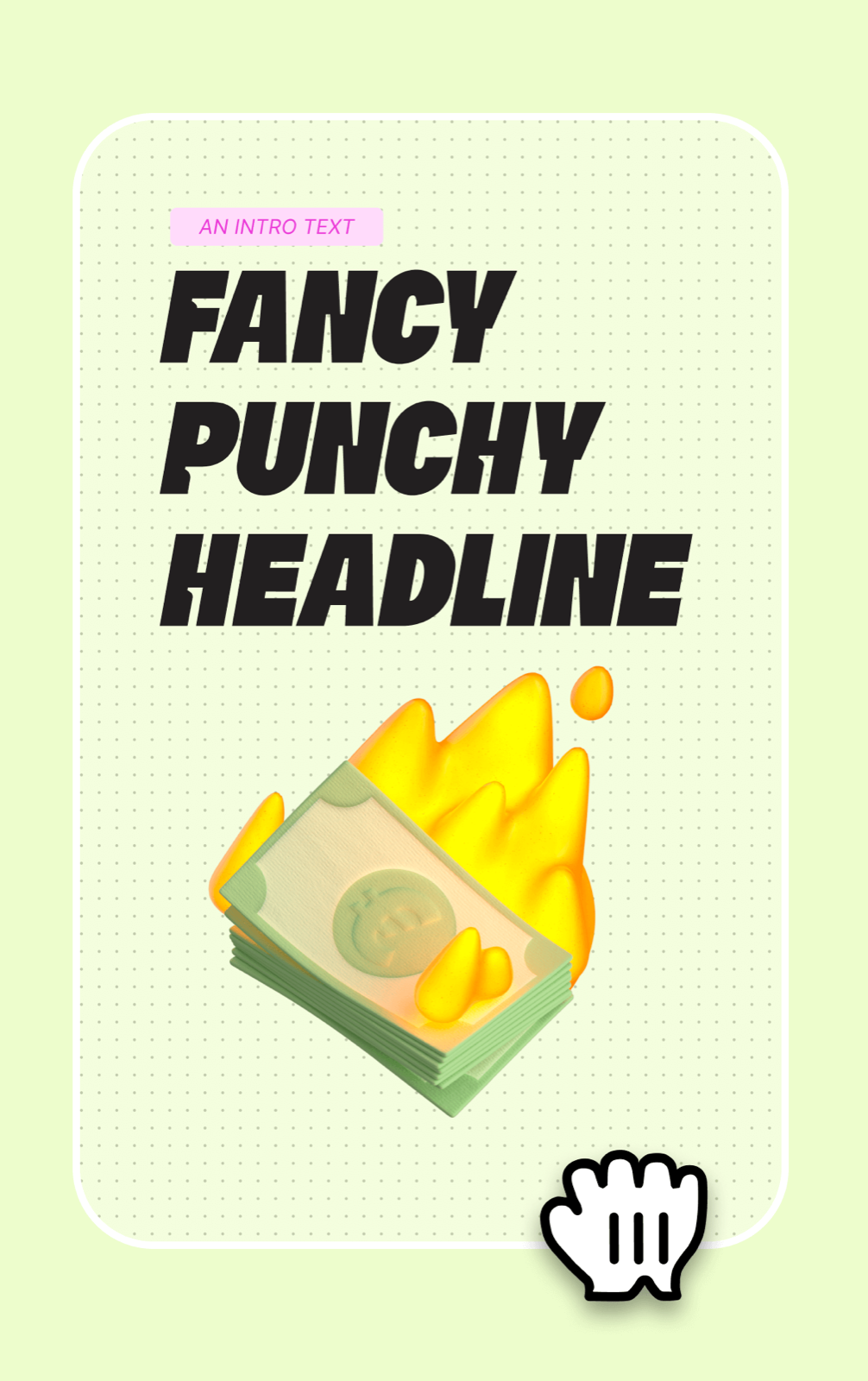
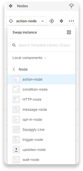
Flexible components
With auto layouts and variants the sketching, production, prototyping and handover of new sections of the website were optimised exponentially.

These are some of the components that are part of the library, it allowed other team members to test and iterate very quickly on usability and readability.
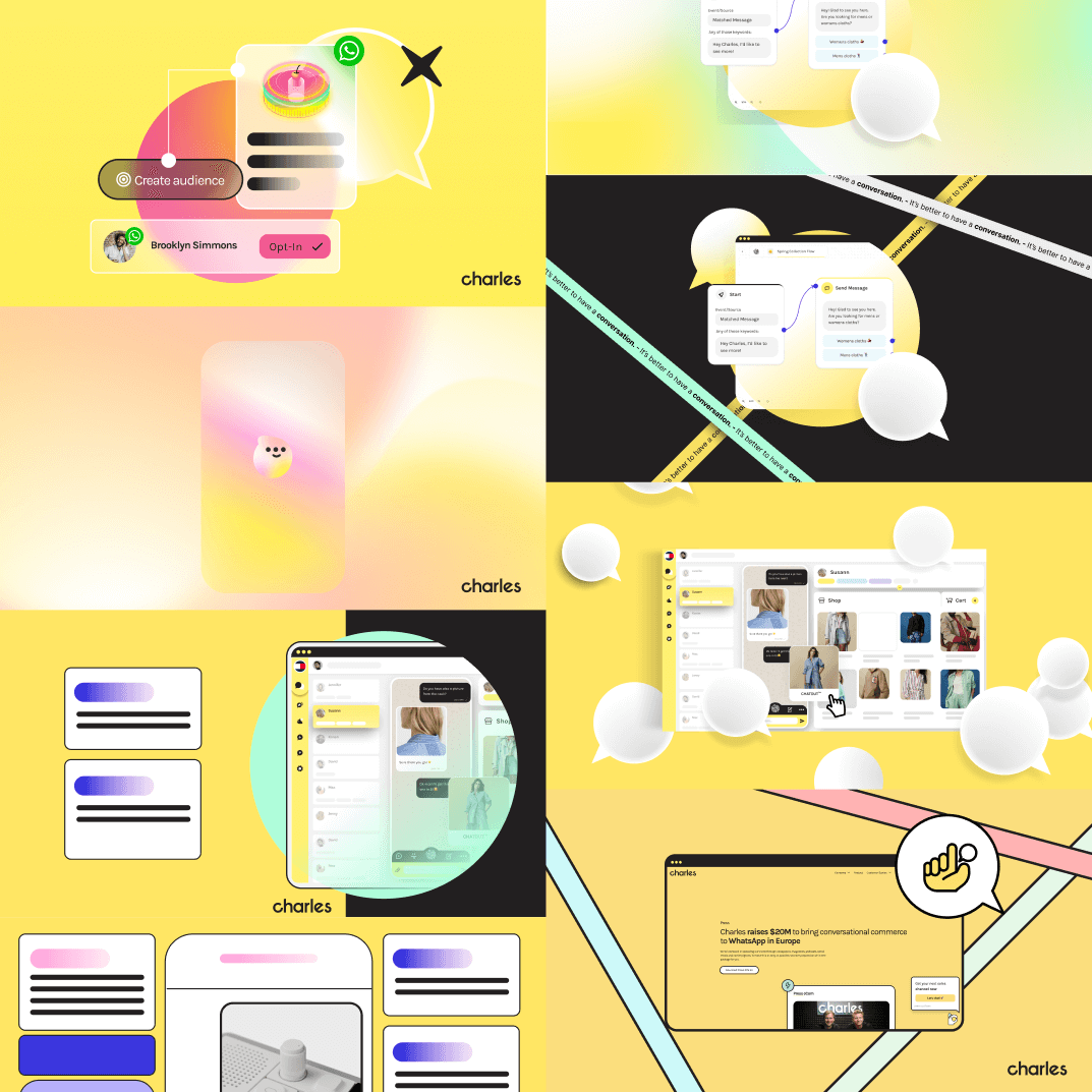
Also social media and ads!
We took some liberty from the usual guidelines, but this is how we pushed the brand to evolve and to bring in extra ideas.

These are a few of the assets used across all charles channels